Split & Compare Modes
Off, Overlay, and Side — comparing terrain/basemap sources against each other
Split Mode (Compare and Blend) controls how many "views" of the map are on screen and how they relate to each other. It's the same three-way choice in both Terrain and Historical Imagery mode, and Side takes any grid up to 4×2 (8 views, labeled A–H) in either.
Off, Overlay, and the Terrain-mode Side pane below all share the same tilted Matterhorn viewpoint (Mapterhorn vs. AWS Terrarium), so the three modes are directly comparable — same camera, same two terrain sources, just a different compare mechanic each time.
Off
A single map view — the default. A plain tilted Hillshade on Mapterhorn's LiDAR-grade DEM over the Matterhorn massif, showing off the source's real resolution (ridgelines and rockfall texture that a coarser global DEM would smear away):
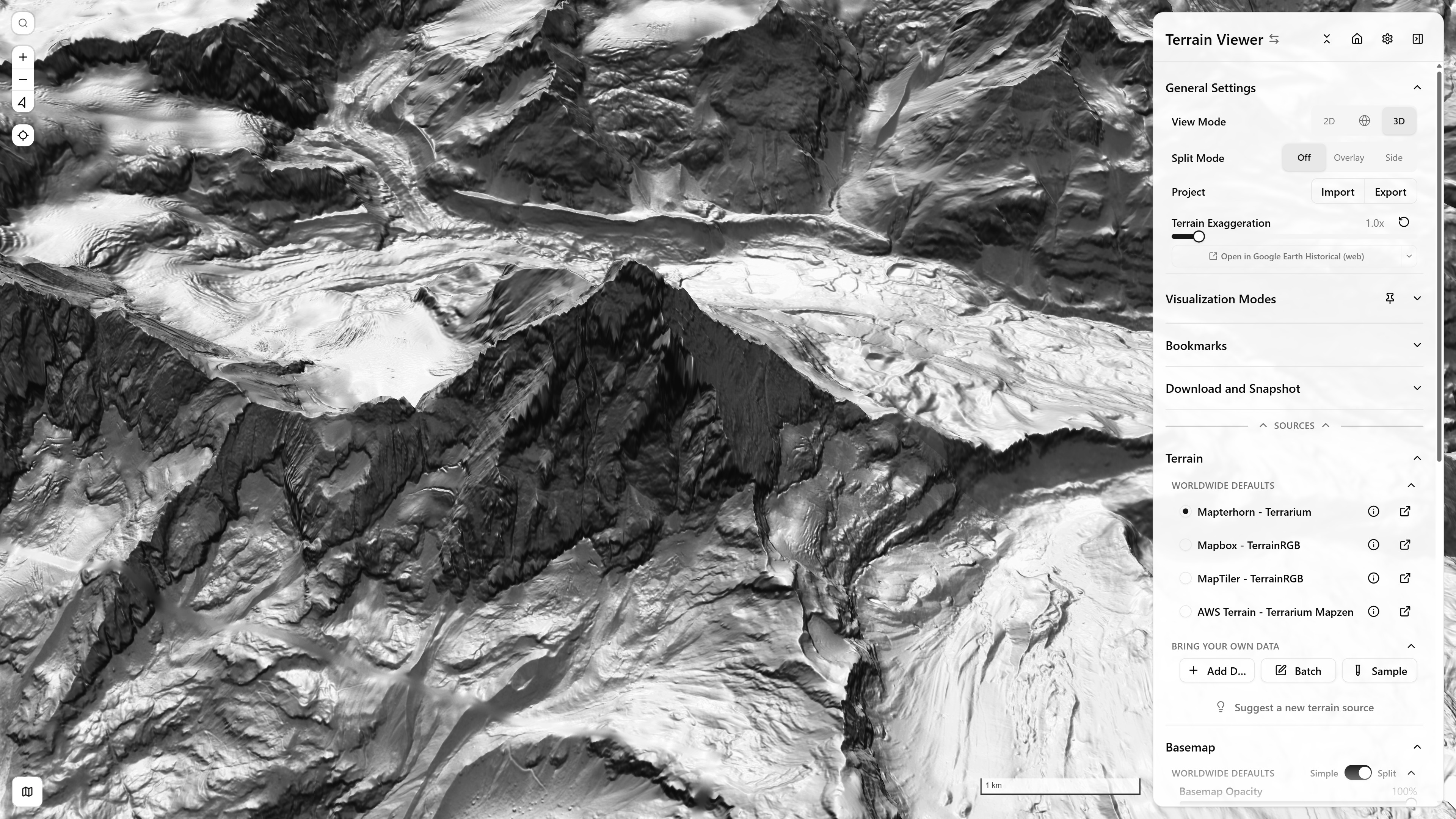
Split Mode: Off — pure Hillshade, tilted — Matterhorn massif — open in app ↗
Overlay
Two sources blended in place, with a draggable gutter (clip position) and a circular handle (blend opacity) directly on the map — see Bring Your Own Data and Terrain and Basemap Sources for what sourceA/sourceB can be. The gutter itself is centered on the space actually available left of the sidebar, not 50% of the full screen:
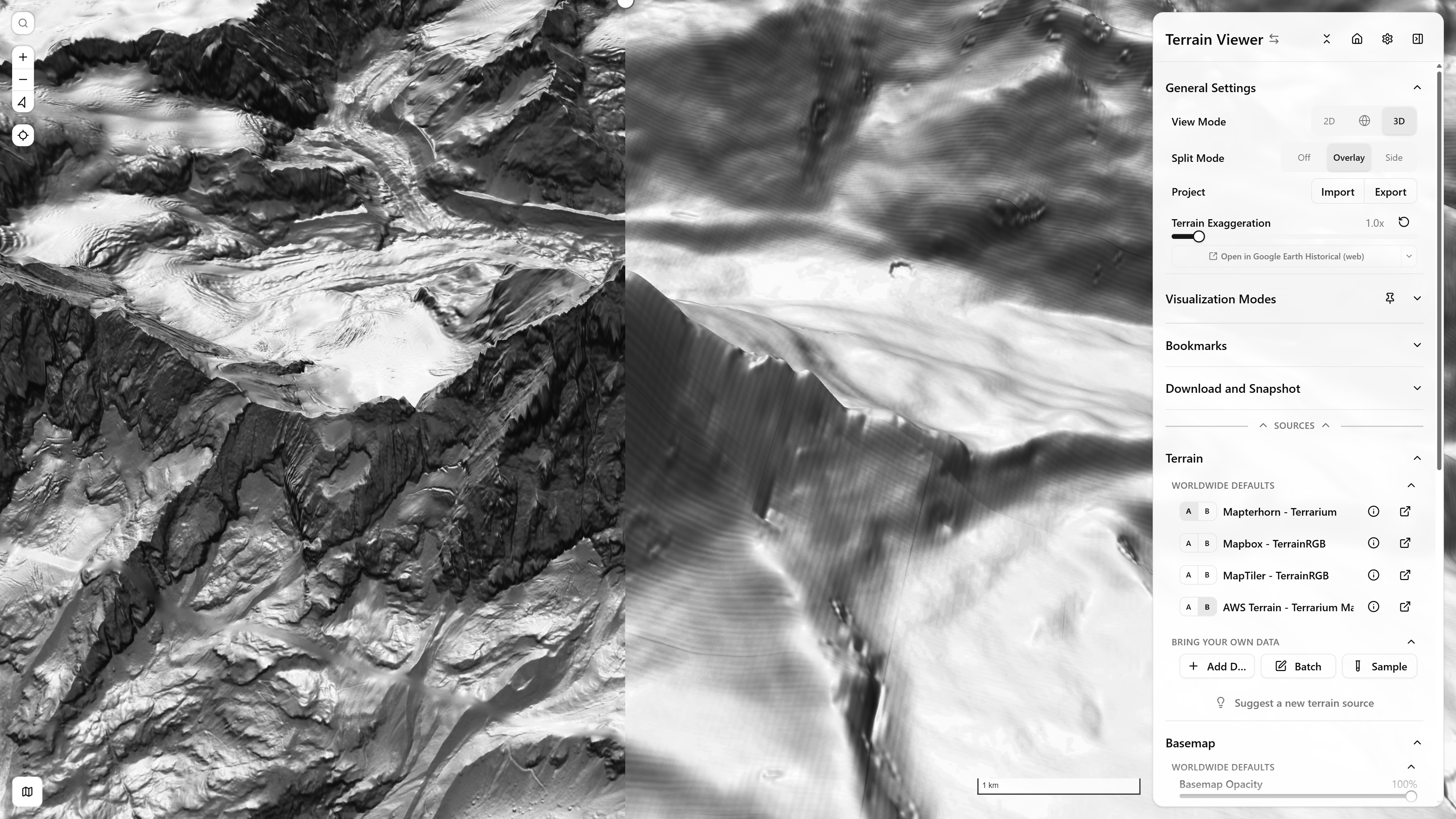
Split Mode: Overlay — Mapterhorn vs. AWS Terrarium terrain, 100% — Matterhorn massif — open in app ↗
Side
Terrain mode is always a fixed 2×1 pane pair — compare two terrain or basemap sources directly. Same Mapterhorn-vs-AWS pair and viewpoint as Off/Overlay above, this time as two independent panes rather than a blend:
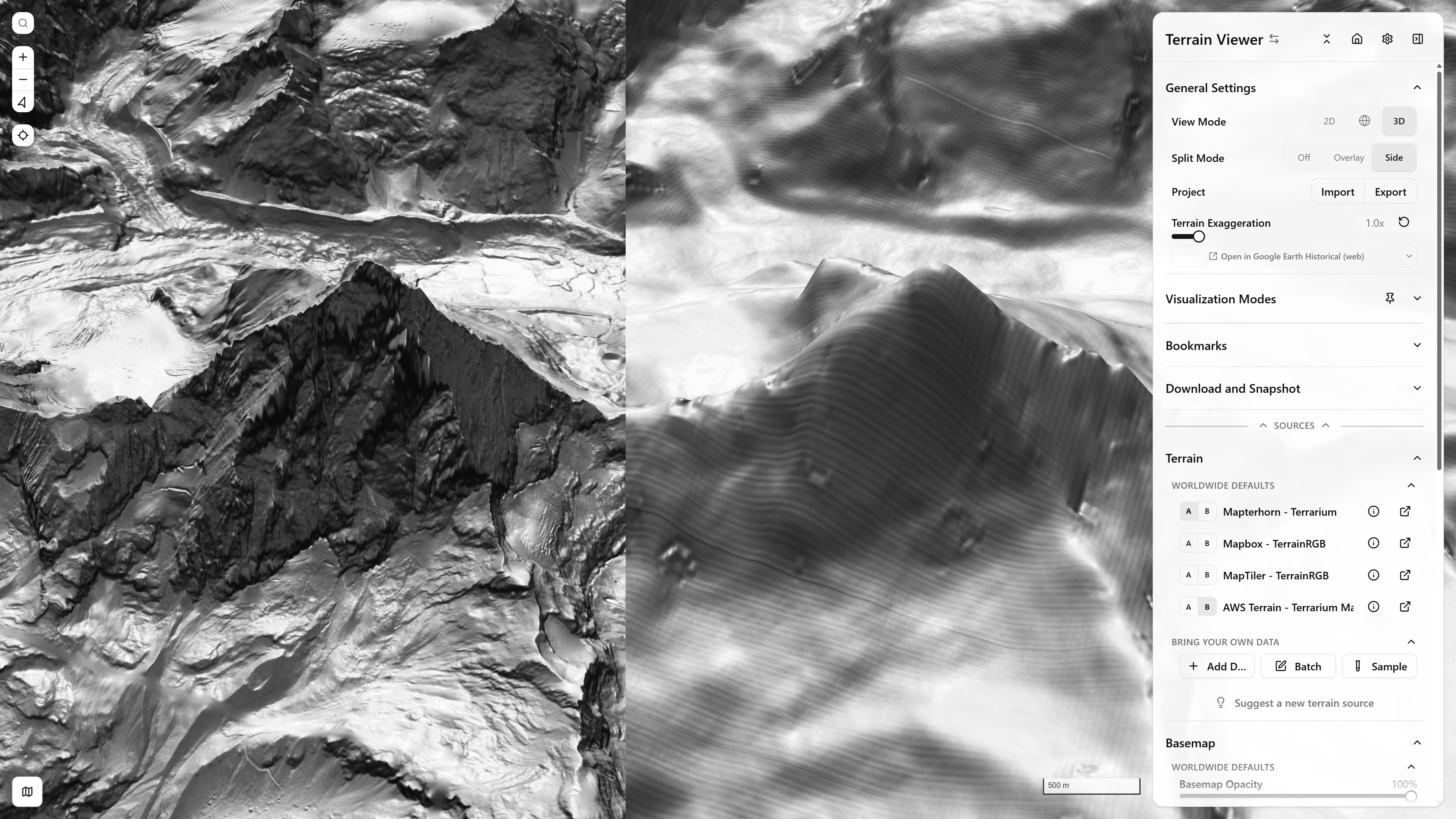
Split Mode: Side (terrain, 2×1) — Mapterhorn vs. AWS Terrarium terrain — Matterhorn massif — open in app ↗
Historical Imagery mode can grow to any grid up to 4×2 (8 views) — see Basemaps & Historical Imagery for the grid picker and timeline. Each view gets its own basemap source, capture date, and a colored border matching its handle on the timeline. Zoomed in tight on Île de la Cité and the Seine, the difference between providers is obvious: Wayback panes stay crisp, while the Google Earth Historical panes fall back to a much coarser, irregularly-resampled capture (visible as flat color blocks rather than actual imagery) for that date/location:
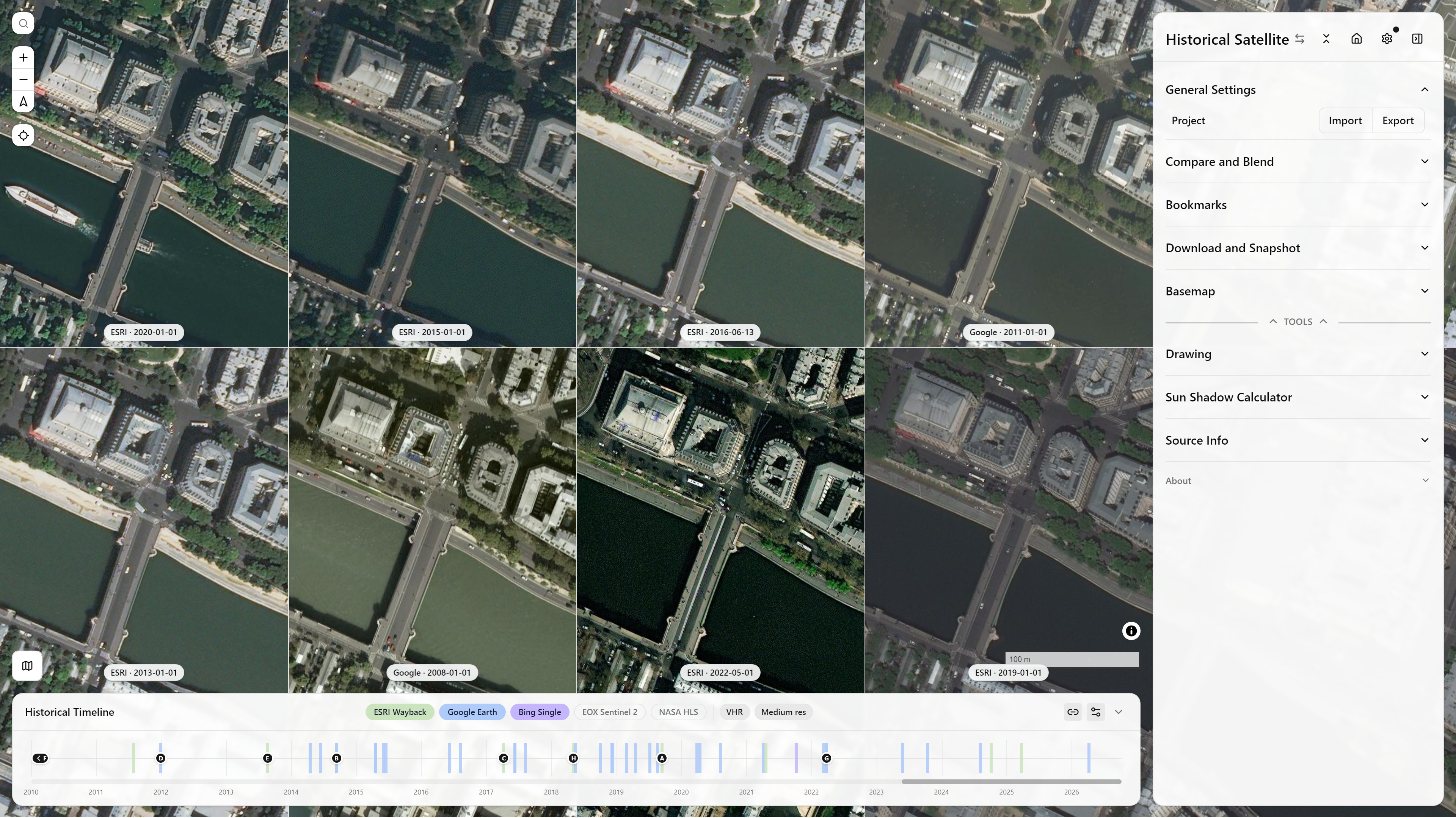
Split Mode: Side (historical, 4×2) — 8 views mixing ESRI Wayback and Google Earth Historical across different capture dates — Île de la Cité, Paris, France — open in app ↗
A smaller, 2×2 example comparing basemap sources:
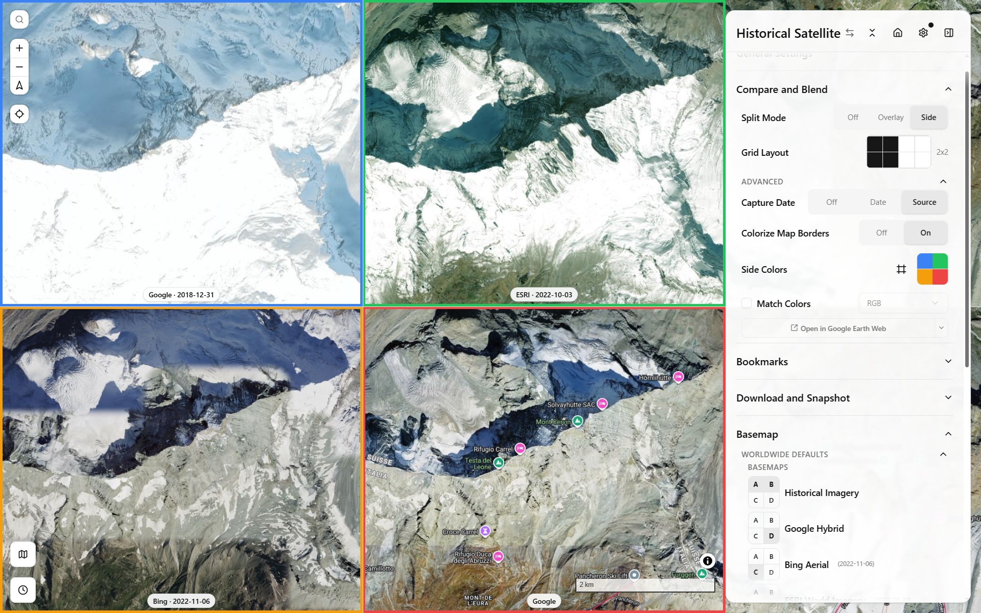
Split Mode: Side (historical grid) — comparing basemap sources
Historical Split & Compare Blend Modes
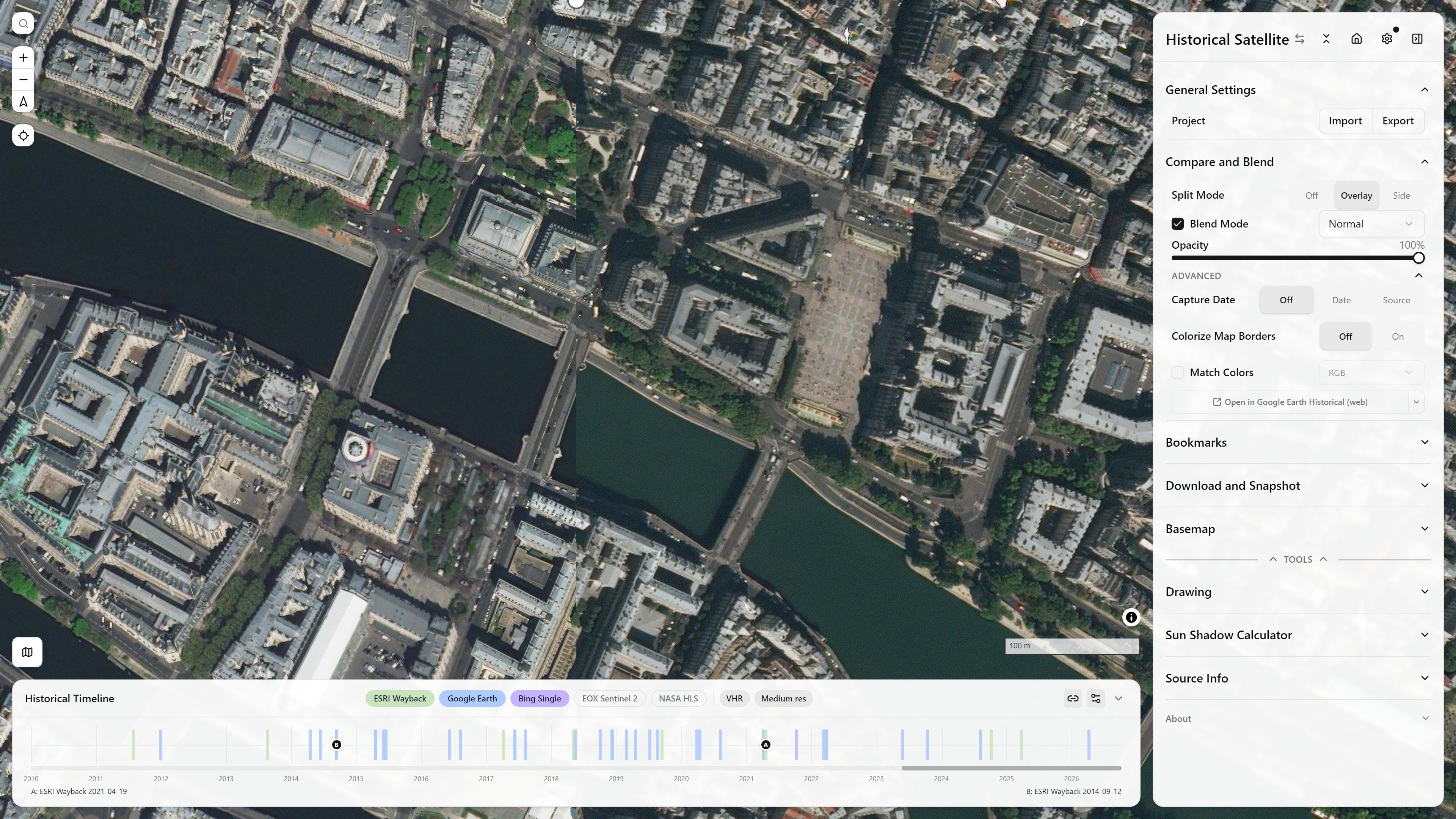
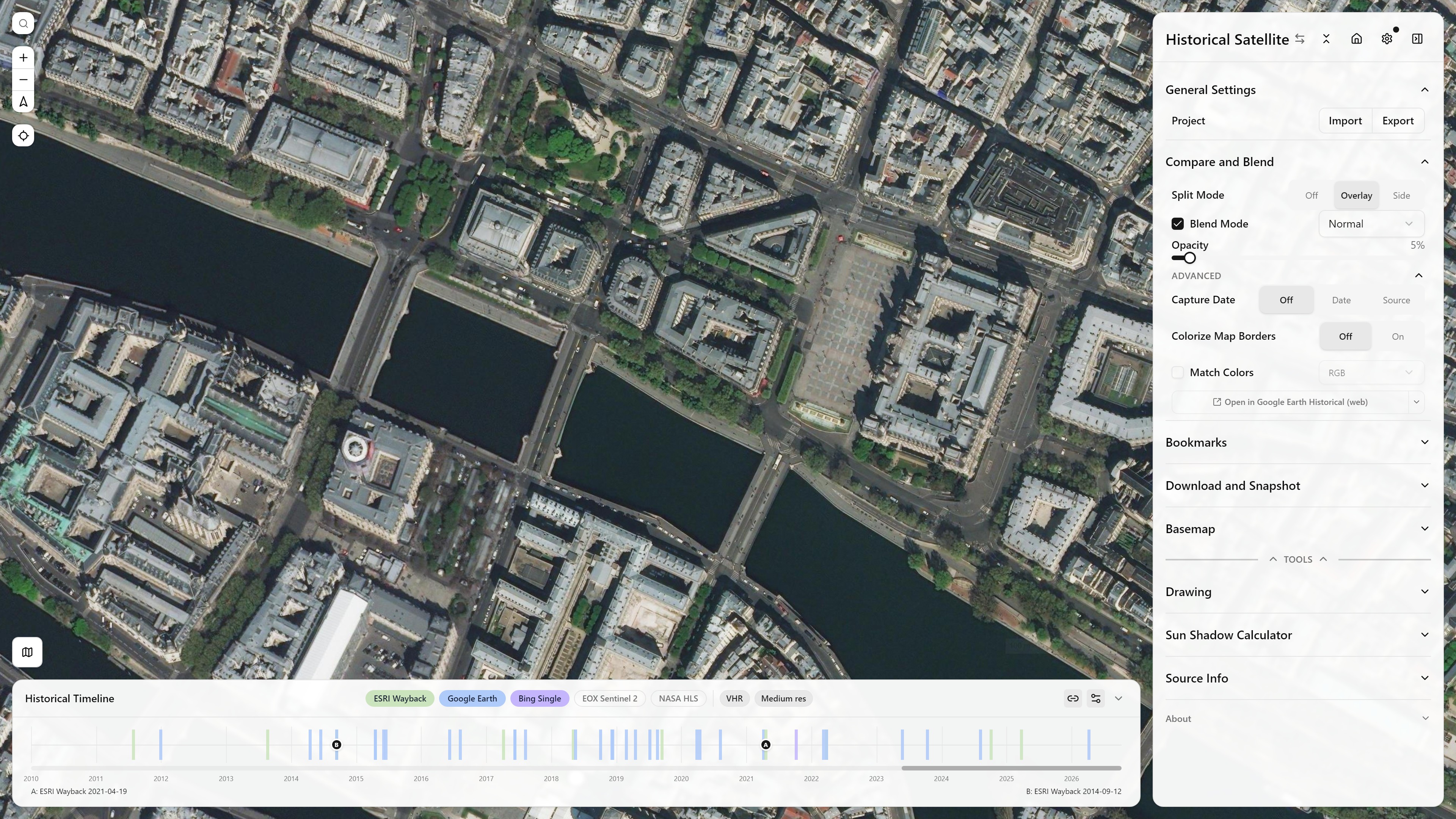
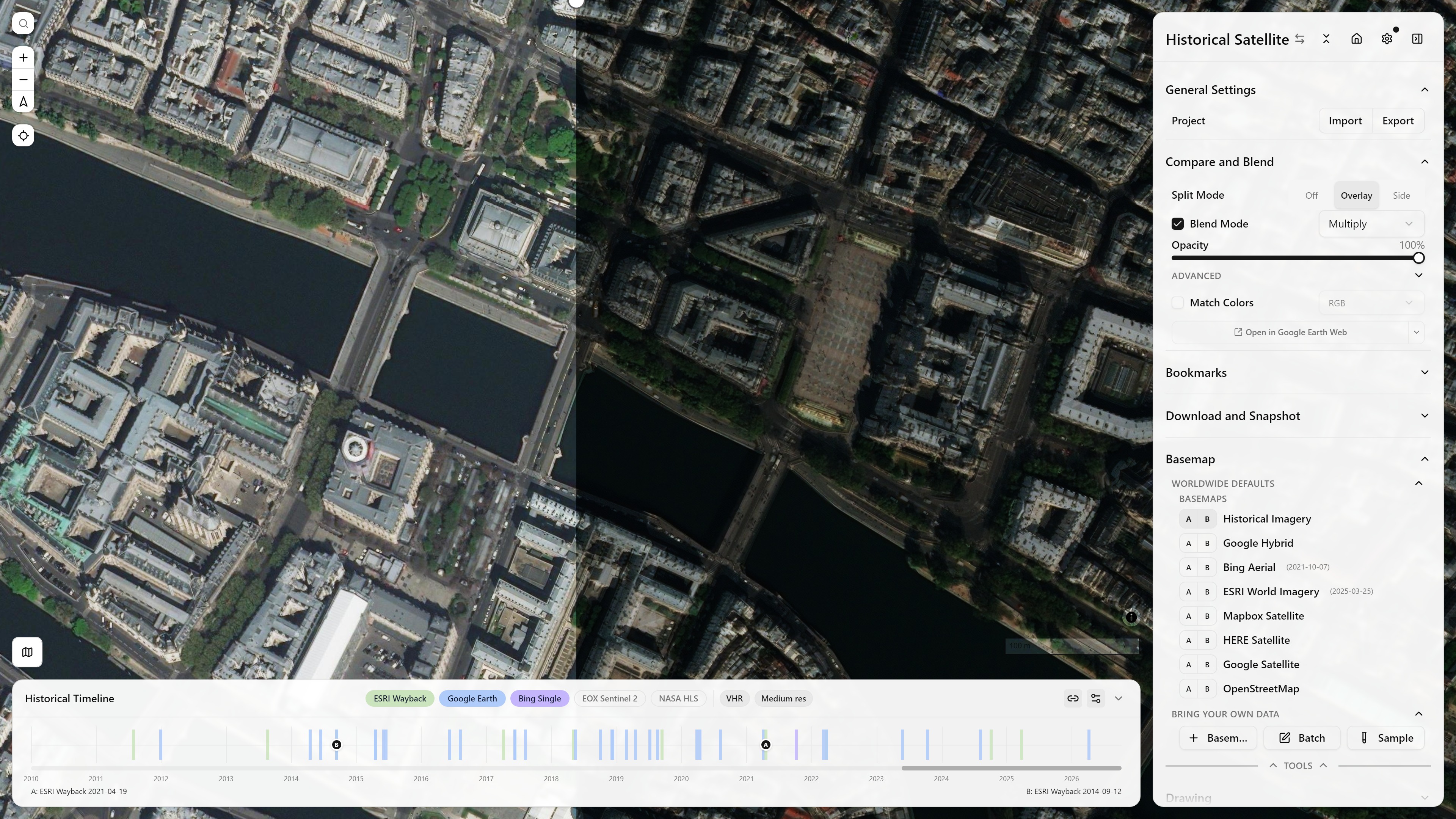
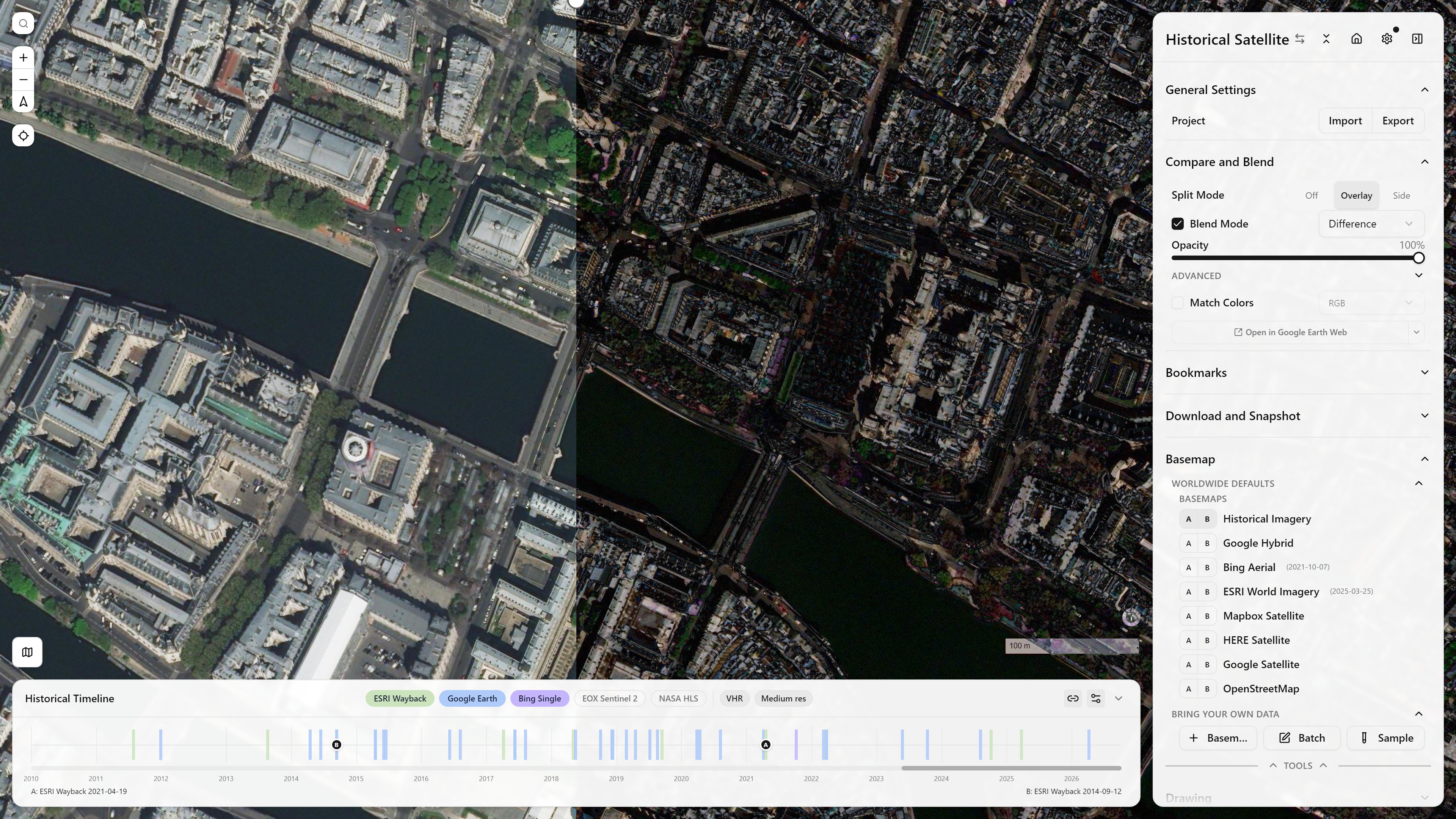
Overlay mode's Blend Mode dropdown controls how source A composites over source B — beyond the default Normal (opacity-only cross-fade), Multiply and Difference make change between two dates easier to spot at a glance. All four below compare the same two ESRI Wayback captures of Île de la Cité (2021 vs. 2015), Normal shown at both a near-total 100% and a near-invisible 5% to show the opacity slider's full range:
Color Matching (Match Colors)
Match Colors (Compare and Blend) automatically recolors every other view onto view A's color histogram, so two different imagery sources — or two different dates of the same source — no longer look noticeably darker/bluer/warmer next to each other when compared or blended. A Color Space picker controls how thorough the match is: RGB (the default) is instant, while HSL / HSV / LAB / LCH are slower but can match more subtle color differences.
The same 2×2 grid over Zermatt (Bing Aerial 2003, Google Hybrid, ESRI World Imagery 2023, Mapbox Satellite), with and without Match Colors — with it on, views B–D take on view A's warmer 2003 Bing palette instead of each keeping their own look:
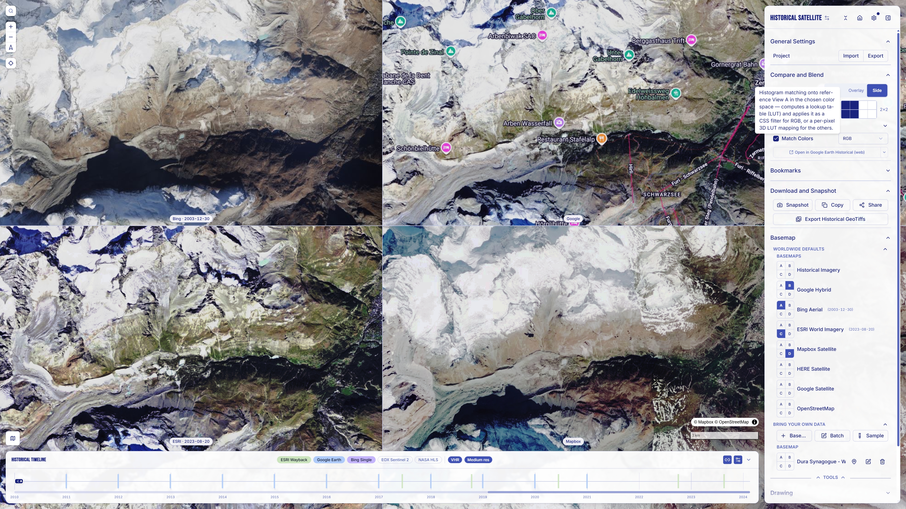
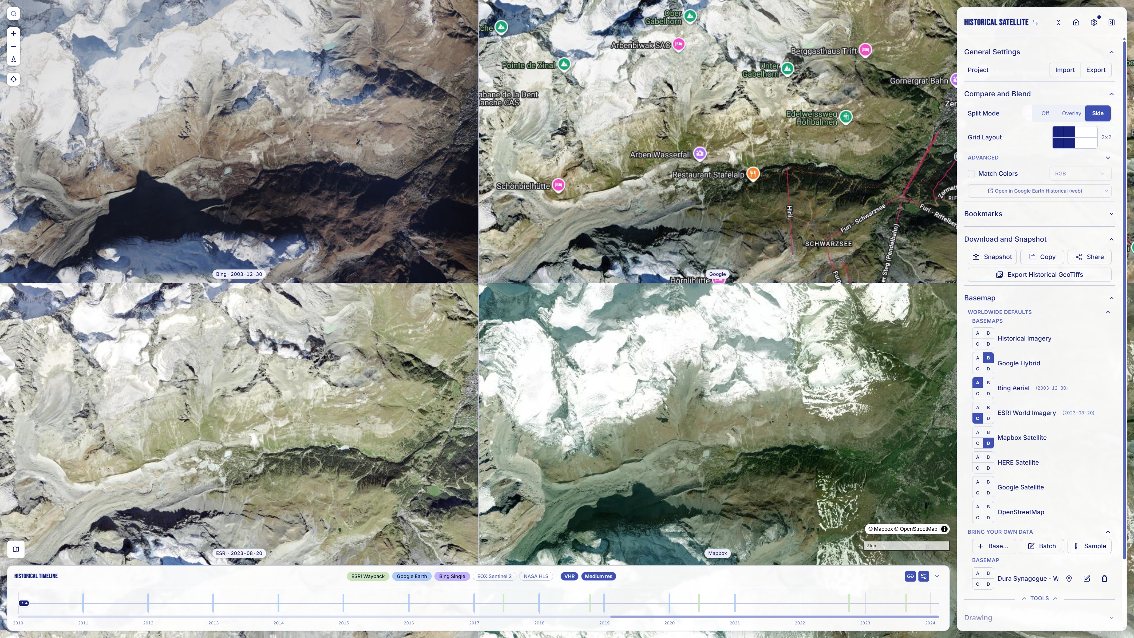
In the default RGB space, the match works by computing a Look-Up Table that maps the target's per-channel Cumulative Density Function (sampled from a subsampled 96×96 copy of its canvas) onto the reference's CDF, then applying that LUT as a live CSS SVG filter — an feComponentTransfer — on the target map's canvas. See the full pipeline in the folded details block below.
Under the hood (HistogramMatchFilter, one instance per non-A view), both color-space paths share the same sampling front-end, then diverge in how the correction is computed and applied.
Shared front-end — sample what's actually on screen. The reference (view A) and target canvases are each drawn downscaled onto a small 96×96 offscreen canvas and read back with getImageData — so the match is always based on the tiles currently rendered in the viewport, not the raw source imagery. It re-samples whenever either map settles (on idle), debounced to at most once per second, so the correction tracks whatever loads as you pan and zoom.
RGB — a live CSS filter, zero pixels touched:
- Build a per-channel 256-entry LUT. Independently for R, G, and B, the target sample's cumulative distribution is mapped onto the reference's (exact empirical-CDF histogram matching, scikit-image style) — yielding three lookup tables of 256 output values each.
- Serialize the LUT into the filter. Each LUT is turned into a space-separated string of 256 values normalized to 0–1 and written into the
tableValuesattribute of<feFuncR/G/B type="table">inside anfeComponentTransfer, in a hidden 0×0<svg><filter>the component renders. The filter is declaredcolorInterpolationFilters="sRGB"so the tables operate on sRGB values, not linearized ones. - Attach it via CSS.
targetCanvas.style.filter = "url(#histogram-match-to-reference-<id>)"— the GPU composites the correction every frame for free and the live map stays fully interactive. Updating the match later just means rewriting thetableValuesattributes; the referenced filter re-applies automatically.
The last serialized LUT strings are also remembered across a disable — so toggling Match Colors back on re-attaches the filter synchronously (stale by at most one recompute interval, the same staleness the live filter already tolerates between idle recomputes) instead of sitting visually uncorrected through the one-second debounce.
HSL / HSV / LAB / LCH — a real per-pixel conversion. feComponentTransfer can only remap raw R/G/B output, so these spaces can't be expressed as a CSS filter: instead, actual pixels are converted through a 3D LUT over the chosen color space and drawn onto a static overlay canvas stacked above the live map, at the target's own native resolution (the LUT is what makes that affordable — roughly 100–400ms even at high-DPI fullscreen, where a naive per-pixel conversion took 0.5–0.9s). Because the overlay is a snapshot, it hides itself the moment either map starts moving — motion feedback beats color accuracy mid-gesture — and fades back in once the next recompute lands.
The algorithm is ported from Iconem/historical-satellite's standalone histogram-matching demo, vendored in this repo for reference.
Telling the views apart
Match Colors makes the panes agree; these make them distinguishable again. Both live under Compare and Blend → Advanced, and both are off by default.
- Colorize map borders outlines each active pane in its own side colour. Purely cosmetic, and genuinely useful once you are past two panes — in a 2×2 grid, "which one was C?" stops being a question, and it pairs with the view letter each date pill already carries.
- Inset (the default) draws that border 3 px in from the pane edge, so it reads as a frame. Turning it off puts the border flush against the edge and doubles its stroke width, so a flush border does not read as thinner or weaker than an inset one.
- Each side's colour can be overridden individually, from the same Advanced block. The override is shared between a pane's border and its timeline pill, so the two never disagree about what colour view C is.
These are local preferences (colorizeMapBorders, colorizeMapBordersInset, sideColorOverrides), not part of the shared link — a link carries what the views show, not how you chose to frame them. Like the other pane chrome they are excluded from snapshots, so a composite never comes out with a stray coloured frame around each tile.